
Dungeon World: Raising the Bar(e Minimum)

I figured that maybe at some point I could hire an artist, but for the time being I was content with the covers I was able to produce: they were comparable if not better in quality to the art I'd seen in plenty of other indie products out there, and at the time they took a while to make.
But as we kept releasing more and more stuff, I just kept doing the art, and I got better and faster.
Way better and faster, in fact, to the point where I started adding interior art to our products, and ultimately took on the task of doing all of the art for A Sundered World myself. We've since released a few art packs for people that want a lot of good art, on the cheap, without having to pay for licenses, royalties, or anything like that.
We didn't stop there, though. When it comes to Dungeon World classes, we're one of the handful of publishers that don't just charge you a couple bucks for a couple pages: we add bonus content like extra moves, magic items, compendium classes, and monsters, explanations for some of the potentially confusing moves, etc.
Eventually we also started breaking from Dungeon World's "bare minimum" formatting and layout. I think about the time we wrote The Cultist, we'd been adding horizontal rules to help better visually divide sections, and this was followed by The Oni, which marked the first time we'd offered a full-color version of the digest pdf.
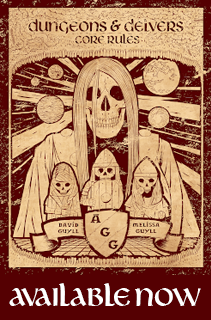
This brings me to If These Stones Could Scream. Its current layout is about what you'd expect to see from most indie products: black text on blank white pages (and sometimes pages that are completely blank). Really the only difference (aside from not having any blank white pages) is that we deviated from the practice of "cramming in lots of Creative Commons art" to pad things out. Here's an example of what I mean:

Not much to it, right? I blame Dungeon World and various other indie creators for pushing this "standard" of "quality", which again is really more of a bare minimum.
Don't get me wrong: I know that there are people that can't draw, and don't have the time and/or money to pay for art, editing, layout and the like, but it's still no reason to pretend that it's something to strive for, let alone praise-worthy (or, even more ridiculous, superior to a product made by a big company with an actual budget).
I want to thank Ant Wu over on G+ for suggesting that we add some color to our upcoming adventure, Primordial Machine. We were already going to update If These Stones Could Scream with more art, but it's because of him that we've decided to just start doing all of our stuff in full color. Here's an example of what I mean:

Much, much better. We'll still provide "print-friendly" pdfs for those that want to print our stuff off at home (or for those that just don't like full-color), but with Melissa coloring my illustrations it doesn't add much to the workload to give you guys more bang for your buck.
In addition to all of that we're adding new maps, and changing/updating some of the moves, monsters, and magic items to be more on par quality-wise with what people have come to expect from us (it was originally written almost two years ago).
Our goal is to have the new edition of If These Stones Could Scream out by the end of the month. We'll be bumping up the price a bit, but anyone that's already purchased it will get the new one at no extra cost.
Announcements
 Lichfield is available for public consumption. If you want a concise adventure with a Silent Hill feel, be sure to check it out!
The Golem is our latest "monster" playbook, and the fourth to be made due to fan demand. Next up is The Rakshasa, followed by a few more that we're not ready to talk about just yet (one of which features yet another character sheet design).
On the topic of classes, I want to give a shout out to Maria Rivera's The Lich. I not only provided some design insight and content, but also did the cover (with the help of Melissa, who colored it), the logo, and layout for both the digest pdf and new character sheet.
If you're interested in having Melissa and I look over a class (or adventure, or whatever it is you're working on), and/or do art, hit us up! We're cheap (or in some cases free).
The Dungeon World GM Screen is currently available in pdf and landscape insert formats. No matter which you choose, you get eight sets of pdfs that let you have access to the screen in both landscape and portrait orientation, in color or black and white, and with or without art.
Next up, mini screen!


The color sample looks really professional; I wouldn't guess it was an indie product if I didn't know better.
ReplyDelete@Svafa: Thanks! I'll let Melissa know, since she's the one that does the coloring. :-D
Delete